The Maps of the Imprisoning War: Age of Imprisonment, Element by Element
This paper exists to close a gap our own earlier research flagged: our first UI/UX pass could only report the critic-level summary that Age of Imprisonment's menus are "near-identical to BOTW/TOTK" — nobody had done the element-by-element teardown. This is that teardown, built from post-launch strategy guides, wikis, and reviews and run through the same adversarial verification as every other paper in this Codex. It gets much further than the first pass — and it's honest about exactly where it still hits a wall.
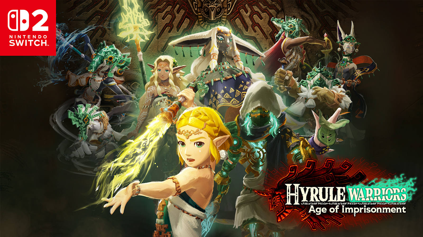
What this paper adds
The original research found only a shape: "the menus look like TOTK's." Nine months of post-launch guide-writing later, the shape has detail. We can now describe, specifically:
- How the in-battle HUD is laid out, element by element, left side to right
- Exactly how Zonai devices are equipped, resourced, and fired
- How the minimap represents outposts, enemies, and objectives
- The full mechanics of the Age of Calamity-style off-screen ally command system
- What a specific post-launch patch changed about map navigation
What it still can't tell you — despite a real search effort — is what the top-level campaign map looks like, or what Age of Imprisonment's menus are actually colored and drawn like. That gap is documented at the end, on purpose, rather than papered over with a guess.
The in-battle HUD, element by element
The core HUD stacks vertically down the screen's left side: Life Gauge (hearts) on top, then a large yellow Special Attack Gauge that fills as you land hits, then an Energy Cells readout tied to Zonai device use. Further down-left sit a KO counter (enemies defeated) with an Experience Gauge beneath it — both of which auto-hide from the screen whenever you aren't actively earning experience, keeping the corner clear the rest of the time.
The D-pad doubles as a shortcut layer, not just a directional input: left and right open the Map and a favorite-items shortcut (which also displays whichever Zonai Device is currently selected), while up and down cycle between your active playable Warriors. An optional combo-sequence display can be enabled beneath that Warrior-switch list for players who want their attack strings spelled out on-screen.
Powerful enemies — what the game calls "Dangerous Enemies" — get their own on-screen treatment: a name and life gauge displayed above them, and individual targetability that ordinary mob enemies don't have. Only these enemies carry a Weak-Point Gauge, exposed by landing Unique Skills, countering a telegraphed attack, a perfectly-timed dodge into a Flurry Rush, or sometimes automatically after you land a Special Attack on them. Fully depleting it triggers a large damage payoff — the game's version of the "stagger and punish" rhythm familiar from the Warriors genre generally.
Sync Strikes and the Sync Gauge
Sync Strikes are the headline new mechanic layered onto BOTW/TOTK's inherited visual language. Two nearby characters build a shared Sync Gauge; once it's full, pressing L triggers a team-up attack. Nintendo Life describes the gauge pulsating blue in a screen corner once ready. The mechanic is introduced early and deliberately: the very first Sync Strike, with Sonia, unlocks mid-battle in the Chapter 1 tutorial fight once boss Rauru's health drops to roughly 25% — the game teaches the system by scripting its first use rather than leaving you to discover it.
Zonai devices: equip, resource, fire
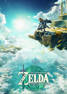 Tears of the Kingdom (2023) — the game whose Zonai-device paradigm Age of Imprisonment carries forward almost unchanged.
TOTK's Zonai-device paradigm carries forward with a genuine interface change: rather than a radial wheel, devices are assigned per-character through an Inventory/Special Actions menu to a face button or to ZR (guides specifically recommend ZR, since face buttons are needed for each character's Unique Skills). In battle, you activate the assigned device by holding R or pressing ZR directly.
Two separate resource systems govern device use, and they aren't the same thing:
- An Energy Gauge (Energy Cells) that depletes only while you're actively using a device via R/ZR, turns from green to red as it empties, and auto-recharges afterward.
- A Battery System, entirely separate: you start each battle with three Batteries, they refill slowly and passively over time, and resting at a Camp restores them faster — except that camp-based Battery restoration is explicitly disabled on Hard and Very Hard difficulty, a small but real difficulty-curve decision baked into the UI's resource economy.
Holding R also opens the items/device menu while quietly slowing (not pausing) game time — guides recommend using this defensively, buying a beat to line up a counter or dodge against fast enemies rather than just as a menu-browsing convenience.
The minimap and outpost capture
The minimap sits bottom-right, with the active mission's text displayed above it and mission destinations flagged by a dedicated icon. Outposts — the map-control objective familiar from the Warriors genre — appear as diamond-shaped shield icons: red for enemy-held, blue for allied. Each has a central guardian enemy whose defeat flips control, plus a collective health bar drained by killing the enemies stationed inside it. Ordinary enemy groups show as plain red dots; Powerful/Dangerous Foes show as red dots with an outline, giving you a threat read before you're close enough to see a name tag.
Hidden collectibles are deliberately not shown by default. Korok-equivalent collectibles stay off the minimap until you complete specific Battle Support quests — "The Test Subject" (2 Korok Seeds, unlocked post-story) rewards a permanent "display hidden Koroks on minimap" upgrade, while a separate quest, "Dancing in the Rain," rewards revealing the total count of hidden Koroks on a stage's map-info screen without showing their locations. Treasure-chest detection follows the same quest-gated pattern. This is a genuine, documented design choice: the map's information density is something the player unlocks, not something the game hands over at the start.
Commanding allies from the map
The clearest direct lineage from Age of Calamity: pausing, or opening the map/Allies screen, lets you issue movement orders to characters you aren't currently controlling — direct a single ally or the whole party to a point on the map by placing a target icon, and they start moving immediately without switching your control away from whoever you're playing. It's unlocked early, via the Chapter 1 quest "Where Ancient Wisdom Sleeps," and multiple guide sites maintain dedicated "how to give orders" pages for it — a sign it's load-bearing to how battles are actually played, not a buried option.
A documented post-launch change
Update 1.0.1 made one feature change worth recording here specifically because it's a map-navigation change: pressing Y while on the campaign map screen now jumps directly into the Aside Quests (side-mission) list, collapsing what had been a multi-layer menu path into one button. Every other line in that patch was a bug fix — Nintendo shipped exactly one UI improvement in that update, and it was to the map.
What still isn't documented — and why that matters
This is the section our first UI paper's open question asked for, and we're keeping it explicit rather than quietly dropping it:
- The top-level campaign/world map's actual appearance. Is it a Hyrule overworld visibly divided into regions reclaimed from Ganondorf's forces, as one review's framing suggested? What do the map's zoom levels look like? What distinguishes a main-story battle node from a side-mission node from a training/shop node, visually? No source survived adversarial verification describing this — it is a real, current gap in publicly available Zelda reference material, not a gap in our search effort. (We tried; see the sourcing note below.)
- Icon vocabulary and color language. Does the UI visibly reuse TOTK's Zonai green-gold and glowing-circuit motifs, Age of Calamity's conventions, or something new? Every source we found was gameplay-mechanics-focused (how systems work), not visual-design-focused (what they look like). This is the exact question our earlier "design language observations" section had to answer by inference from critic summaries — and it still can't be answered with element-level confidence.
- Meta-systems beyond device equipping — a skill tree, training camp, or TOTK-style weapon-fusion system, and what a gallery/memories viewer looks like, if one exists — went undocumented in every source that survived verification.
- Usability reception specifics. What critics and players concretely praise or complain about regarding HUD clutter, menu depth, or load times between map and battle never surfaced as a verifiable claim this pass, despite it being a distinct research angle in this project's search.
- Switch 2-specific UI features — mouse-mode support, GameChat integration, or quality/performance-mode effects on the interface — also remain unconfirmed for this specific title.
One honest note on sourcing: this entire paper is built from secondary sources — fan wikis and strategy-guide sites (Game8, Nintendo Life, TheGamer, Zelda Wiki) — because no primary Nintendo or Koei Tecmo documentation, official patch-note archive, or structured UI database entry for this title survived our verification pass; two direct wiki fetches returned errors and had to be reconstructed from search snippets instead. Several individual claims here rest on a single well-corroborated source rather than several independent ones. That's disclosed per-claim in the sourcing, consistent with how every paper in this Codex handles confidence.
Sources
- Game8: Hyrule Warriors: Age of Imprisonment (and multiple linked guide pages on Sync Strikes, Zonai Devices, Weak-Point Gauge, Korok Seeds, and Battle Orders)
- Nintendo Life: Age of Imprisonment walkthrough guide, tips and tricks
- Zelda Wiki: Hyrule Warriors: Age of Imprisonment
- TheGamer: Age of Imprisonment Zonai Devices combat guide
- Nintendo Reporters: Update 1.0.1 fixes and the new map shortcut explained
- games.gg: Age of Imprisonment combat guide
— Chronicle Slate, July 2026