Switch-Era Zelda UI & Menu Design: A Research Paper
A research-backed survey of menu, map, and HUD design across the Legend of Zelda games released on Nintendo Switch and Switch 2, produced by a multi-source, adversarially-verified research pass. Findings below are cited to their sources; confidence and caveats are noted where the underlying evidence was mixed. This paper exists to inform an original, non-infringing visual design for this site — see Design Language Observations — not to reproduce any of the games' actual assets.
1. Breath of the Wild: the diegetic device, the non-diegetic HUD
 Breath of the Wild (2017) — the diegetic Sheikah Slate over a minimal non-diegetic HUD.
Breath of the Wild's interface is built from two deliberately separated layers. The Sheikah Slate is a diegetic, in-world device: an ancient artifact Link physically carries that houses the map, camera/Hyrule Compendium, and rune abilities, and which other characters can see and react to in-fiction. Layered over the game world independently of that device sits a minimal, non-diegetic HUD — hearts, a stamina wheel, a minimap, and objective markers — chrome that exists for the player, not the character. The Game UI Database formally catalogues this combination as a "Flat 2.0" style, and independent UI/UX design writing agrees on the same two-layer framing: an immersive, physical device for deep interaction, and spare overlay chrome for moment-to-moment readability.
This diegetic/non-diegetic split is the throughline of everything BOTW is praised for: a HUD that gets out of the way of the open world, and a menu system (the Slate's rune wheel, the map, the compendium) that feels like an object Link owns rather than a system laid over the game.
The praise comes with a durable complaint, though: weapon durability. Because weapons break quickly and must be constantly cycled, players are repeatedly forced into disruptive menu-digging or scavenging from downed enemies mid-combat — a widely repeated criticism of the game's otherwise-minimal UI philosophy, since the one system that breaks the "stay out of the way" promise is also one of the most frequent interactions in the game.
2. Tears of the Kingdom: more device, more menu
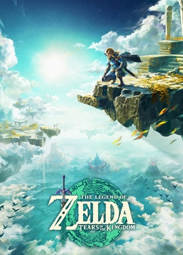 Tears of the Kingdom (2023) — the Purah Pad succeeds the Sheikah Slate, trading runes for Ultrahand/Fuse/Ascend/Recall/Autobuild.
TOTK's Purah Pad is a direct continuity device — it keeps the Sheikah Slate's core diegetic roles (map, camera, compendium recording) — but critics characterize it explicitly as a functional downgrade relative to the old Slate: several specific rune abilities (Magnesis, Stasis, Cryonis, Bombs) are gone, deliberately traded away to make room for the new Ultrahand/Fuse-era toolkit (Ultrahand, Fuse, Ascend, Recall, Autobuild).
Where TOTK draws the most sustained criticism is menu bloat. Despite introducing many new item categories (Fuse materials, Zonai devices and parts), Nintendo added only a single new inventory tab (Zonai Devices/Parts) to absorb them — resulting in an inventory that critics and forum posters (notably a widely-read ResetEra thread, "Zelda has a menu and UI problem") describe as more cumbersome than BOTW's, forcing long scrolls through a linear, filter-assisted list that becomes especially unwieldy when deciding what to Fuse mid-combat. A frequently cited, independently corroborated player observation from r/Zelda (picked up by gaming press) found the Key Items menu's own color-coding internally inconsistent: of the five core ability icons, only two (Recall, Autobuild) match their associated Sage's-vow color, while three (Ultrahand, Fuse, Ascend) don't — undermining the visual system the menu seems to be trying to establish.
The Autobuild feature draws its own specific, commonly repeated friction points: only 8 "Favorites" slots (called "too restrictive" by critics), no way to register an empty favorite slot without first attaching a throwaway object to a build to save it, and imprecise object-rotation controls during Ultrahand building — for which critics have proposed gyro-based or free-rotation analog-stick alternatives as fixes Nintendo could ship.
Caveat: several of these specific criticisms (the amiibo-menu crowding complaint, one blogger's rotation-control critique) trace to single-author blog opinion rather than confirmed critical consensus — real complaints, but individual ones, not verified as representative of the whole player base.
3. Hyrule Warriors: Age of Calamity — BOTW's language, a musou HUD
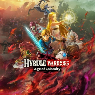 Age of Calamity (2020) — BOTW's Sheikah-tech visual language translated into a musou HUD.
Age of Calamity is a Dynasty Warriors-style ("musou") game, and its UI reflects that genre's structure layered over BOTW's visual language. The Game UI Database catalogues a formal taxonomy that splits the interface into distinct layers, matching the standard Warriors-series pattern: HUD/overlay elements during combat (minimap, player vitals, enemy health/damage/weak-point gauges), an in-mission tactical Area Map for navigating large battlefields, and a separate overworld World Map/level-select screen distinct from the in-mission map. Pre-release screenshots (September 2020, ahead of the game's November 2020 launch) specifically showcased character-switching UI and map design as a "first look" at how BOTW's aesthetic would carry into a musou HUD.
In practice, reviewers found the in-battle minimap clearly legible even in handheld mode on the Switch's small screen, aided by a dedicated zoom control (a left-stick click) for reading complex, unit-dense battle arenas. The recurring complaint is legibility in darker levels: nighttime and indoor missions make enemies and terrain harder to distinguish on the minimap, a problem reviewers specifically called out as worse when playing undocked.
4. Hyrule Warriors: Age of Imprisonment — shipped, not upcoming
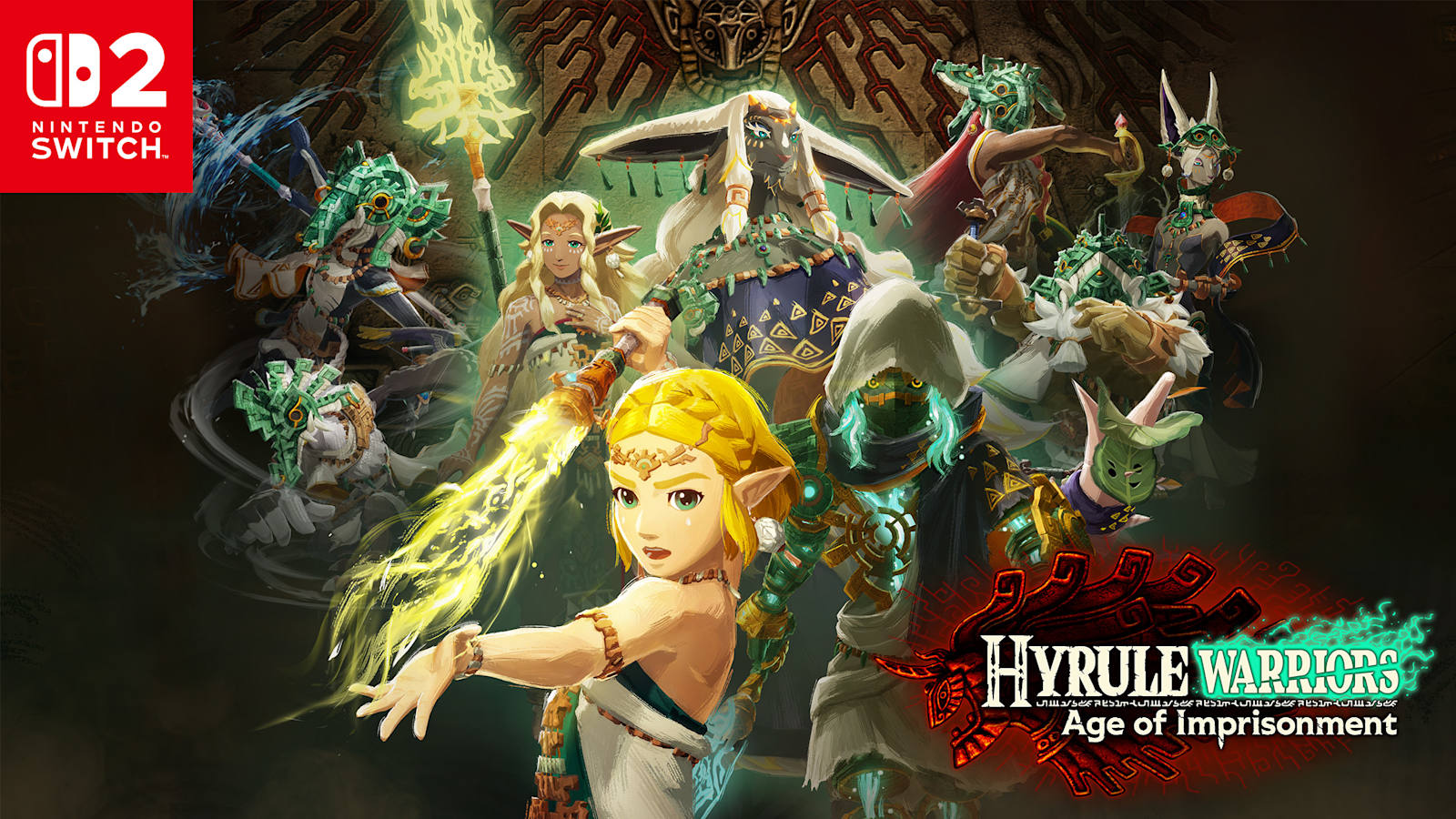
Correction to an earlier assumption in this project's planning: Age of Imprisonment is not a speculative, unreleased "2026 preview" title. It shipped November 6, 2025 for Nintendo Switch 2, has been reviewed by outlets including Nintendo Life and RPGSite, and had shipped over 1 million copies by January 2026.
Reviewers describe its menus and overall UI as near-identical to — in one reviewer's words, "flawless copies" of — Breath of the Wild and Tears of the Kingdom's menu language: Nintendo carried the established Sheikah-tech/Zonai visual system forward wholesale rather than redesigning it for the new hardware, with in-game maps divided into distinct regions the player reclaims from Ganondorf's armies over the course of the story (set during the ancient Imprisoning War, before TOTK). At least one review noted the UI "felt a bit cluttered at times" despite remaining easy to understand overall.
Layered on top of that inherited visual language, Age of Imprisonment introduces several new musou-specific HUD elements not present in prior Hyrule Warriors entries: a Weak-Point Gauge, a Sync Gauge tracking cooperative-attack readiness, a Warrior Special meter charged by dealing and taking damage, a Battery System tracking Zonai-device use, and a new Sync Strikes mechanic — a gauge that fills through combat and, once full, is triggered with the L button to team up with a nearby ally for a combined attack.
Follow-up: a dedicated second research pass took on this open question directly — see The Maps of the Imprisoning War for the element-by-element teardown (HUD layout, Zonai device systems, minimap/outpost mechanics, the off-screen ally command system, and a documented post-launch UI patch). That pass got real, sourced detail on how these systems work — but confirms the icon vocabulary, color language, and top-level campaign map's visual appearance genuinely aren't documented anywhere in currently available sources, "flawless copies of BOTW/TOTK" remains a critic summary rather than a verified element-by-element visual comparison.
5. Switch 2 system-level UI trends
Nintendo Switch 2's Joy-Con 2 controllers ship with a mouse sensor — an optical sensor on the controller's flat edge that lets a player use a tabletop or their lap as a mousepad, for HOME Menu navigation and in supported software (confirmed in use by titles including Metroid Prime 4: Beyond, Mario Party Jamboree Switch 2 Edition, and Drag x Drive). This is a documented, shipped system-level UX capability of the new console generation — but as of this research, it has not been reported as used in any Zelda title's menus specifically. Whether a future Zelda release adopts mouse-mode for map or inventory navigation remains an open question.
Design Language Observations
The following are reusable, non-asset-specific patterns distilled from the research above — used to inspire this site's own original "Chronicle Slate" design system. None of it involves reproducing any actual screenshot, icon, font, or logo from any Zelda game.
- Diegetic framing as a chrome concept, not a literal copy. BOTW/TOTK's strongest, most consistently praised UI idea is treating the primary reading surface as an in-world device the "reader" holds — not a menu that appears from nowhere. This site's "Chronicle Slate" frame (a bordered panel with corner hardware, evoking a device housing the content) borrows that concept — a slate you're reading from — while using entirely original geometry, iconography, and color.
- Minimal non-diegetic chrome, generous whitespace. The consistent throughline of what critics praise (BOTW's HUD) versus what they criticize (TOTK/AoC's clutter) is information density: fewer simultaneous UI elements read as more premium and less fatiguing. This site favors a light HUD (small corner brackets, a legend, a filter bar) over a dense always-on control cluster.
- A device-appropriate, restrained color language. Rather than sampling any game's actual palette, this site uses its own amber/cyan accent pairing against a deep slate background — evoking "ancient technology reading a luminous display" as a feeling, not a copy of any specific screen.
- Distinguish tactical/overview maps from detail views, the way Warriors-series titles separate a world/level-select map from an in-mission tactical map. This site's separation between the branch-diagram timeline (overview) and individual game detail pages (drill-down) mirrors that same overview/detail split.
- Menu bloat is a warning, not a feature to emulate. TOTK and Age of Calamity's most consistent criticism is overcrowded, low-legibility screens (inconsistent icon coloring, cramped ability/map/amiibo selectors, poor low-light minimap contrast). This site deliberately keeps its own controls (branch/canonicity filters, a legend) sparse and high-contrast rather than trying to visually "look busy" the way a battle HUD does.
- Confidence and legibility over authenticity theater. None of this site's iconography imitates Sheikah/Zonai glyphs, runes, or logotypes — original geometric marks (branch dots, era seals) are used instead, keeping the "ancient-tech" feeling as an abstraction rather than a lookalike.
Sources
- Game UI Database, Breath of the Wild and Hyrule Warriors: Age of Calamity
- Diegetic and Non-Diegetic UI, nastyrodent.com
- A UI/UX Analysis of Zelda: Breath of the Wild's and ...from a UX point of view, Game Developer
- Zelda: Breath of the Wild's weapon durability, ScreenRant
- Sheikah Slate to Purah Pad, GameRant
- TOTK's strange menu color choice, GameRant
- TOTK/Echoes of Wisdom UI, a bad change, GameRant
- "Zelda has a menu and UI problem", ResetEra community thread
- Small fixes to TOTK's building system, GameRant
- Hyrule Warriors: Age of Calamity screenshots show the UI, Nintendo Everything
- Hyrule Warriors: Age of Calamity review, RPGFan
- Hyrule Warriors: Age of Imprisonment review, Nintendo Life
- Age of Imprisonment performance/backward-compatibility feature, RPGSite
- Hyrule Warriors: Age of Imprisonment, Wikipedia
- Nintendo Switch 2 features, Nintendo.com (Joy-Con 2 mouse sensor)
- Nintendo Switch/Switch 2 system updates, UI refinements, GameChat, GamingBolt